Saturday, March 28, 2015
the Book Beautiful in New Zealand
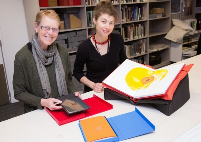
the photo is by Mark Beatty, and here Ruth Lightbourne, Curator of Rare Books at The Turnbull Library, Wellington, and Melissa Bryant, a Master of Information Studies student at Victoria University and a recent intern at the Turnbull show some of my books (Jenson's Greek by Loney, Lullaby by Ross Brighton, and Mondrian's Flowers by Loney and Max Gimblett which was published, not by me but by Granary Books, New York) - the books are part of The Book Beautiful exhibition running from 2 March to 22 May 2015 - "selected by Ruth Lightbourne, Curator of the Rare Book Collection, this beautiful and exquisite grouping includes medieval manuscripts, early hand-printed works from the 15th century, the finest examples of the 19th and early 20th century private press movement, embroidered and jewelled bookbindings, and more. A New Zealand section features a specially commissioned work by Auckland printer Tara McLeod of the Pear Tree Press" -
the term 'book beautiful' is derived of course from the essay The Ideal Book or Book Beautiful by T J Cobden-Sanderson (Doves Press 1900), in which he elaborates a set of ideals in the fields of Calligraphy, Typography and Illustration toward 'The Book Beautiful as a Whole' - I don't have a copy of the Doves Press publication, but a reprint from The Arif Press of Wesley Tanner (Berkeley 1972) - a small volume nicely printed in 500 copies, 350 'sewn in wrappers', 150 'hand bound in boards at the Press' - I wonder if, because Cobden-Sanderson's essay was written just over 100 years ago, a kind of philosophical update might be worth a try, when the world itself and the book within it have changed so dramatically since then - Doves Press was to my mind a far more accurate guide to the future of the book & of type design than was anything by William Morris, even tho Morris was the more influential thinker about the fate of the book against the procedures of industrial production in the late 19th century and the role of craft in the face of industrialisation - so it's nice to see Cobden-Sanderson recalled in the Book Beautiful, and in New Zealand as well, as far geographically from the so-called centres as can be imagined - if you can get to the exhibition, go to it -
Thursday, March 19, 2015
Daidalos lives!
yesterday, a serious-looking box arrived thru the post
with the words ‘Codex Foundation’ noted on the packing slip – it contained the
much-awaited Alchimie du Verbe project : a set of 26 signatures of & by 26 book artists from all over the
world, all hinging in one way & another, as stimulus or counter-stimulus, to
the poem by Arthur Rimbaud having this title – if one was looking for a
snapshot of the life & health of the book as a work of art, then this
collection has everything – most of it based on letterpress printing, but
others relying on linocut, wood-engraving, photography, digital printing, and
one work done solely as writing in pencil – a brilliant register of the spread
of bookish possibility, from the craft-based artisan at one end of the spectrum
to the wit of the conceptual artist at another end – to quote from Peter
Rutledge Koch’s introduction to the collection: “To celebrate the 10th anniversary of the CODEX Book Fair and
Symposium, the Codex Foundation commissioned 26 printers and book artists from
eight countries to contribute a single signature to a printers’ assembling and
exchange entitled Alchimie du Verbe. The
project, designed to support the work of the Foundation, is a compendium of the
printer’s art ranging from examples of fine press printing and typographic
experimentation to the avant garde – an assembling representative of the
collective genius of the CODEX International Book Fair.” –
my ‘favourites’ I will keep to myself, but I want to
list everyone here, and for the most part, googling their names will allow more
to be seen from each one (the order is purely alphabetic) : Walter Bachinski
& Janis Butler, Victoria Bean, Karen Bleitz, Carolee Campbell, Aaron
Cohick, Crispin Elsted, Nacho Gallardo, Martha Hellion, Sarah Horowitz, Mikhail
Karassik, Peter Rutledge Koch, Patricia Lagarde, Clemens-Tobias Lange, Alan
Loney, Peter Malutzki & Ines von Ketelhodt, Russell Maret, Rick Myers,
Didier Mutel, Robin Price, Harry Reese & Sandra Liddell Reese, Dmitry
Sayenko, Veronika Schapers, Gaylord Shanilec, Johannes Strugalla &
Francoise Despalles, Richard Wagener, Sam Winston –
Saturday, March 14, 2015
new book from Cordite Books
here's the cover spread of my first 'commercially published' book of poetry since Day's Eye, Rubicon Press, Canada in 2008 - it continues my Notebooks, tho they have not been continuously issued - the first instalment was Sidetracks : Notebooks 1976 - 1991, Auckland University Press 1998 (copies still available thru AbeBooks.com), and the next is Melbourne Journal : Notebooks 1998 - 2003, as yet unpublished - the current title Crankhandle comes from a friend's request for poems to publish in a venture that didn't materialise, but I had said to him that I'd be happy to "crank out a few poems " for the purpose - and there's a mechanical relationship (however dubious, however distant, however tenuous - perhaps the real & sole connection is the writer's role as cranky crank dwelling outside the mainstream!) between the crankhandle of my first car, a 1930 Plymouth, which I occasionally had to crank into life, and the handle of the handpress which is a constancy in printing on the Albion - the present book will be published in April, and no doubt it will be launched somewhere, so I'll register that information when I know it - here's a bit from Crankhandle -
how make it new
of old words
time
to give
old paper meaning
& old pens the
slip
that
eyes open
old hands for
the first
& old blood time
old books
& old eyes
Thursday, March 12, 2015
&, while I think of it
"do not let the wonder of it get away" - William Saroyan, talking on a recording of him reading from his work I used to have a few decades ago - and, into the bargain, extrapolating from Wittgenstein - and here I am again, also, being Bartleby again - and that via Blanchot - do I have anything whatever to say that doesn't come from another -
the word is everything
that's in the case
Wednesday, March 11, 2015
the very old is now
a glimpse of Gill Sans Greek as used in Peter Koch's edition of Herakleitos, translated by Guy Davenport, and which type I have just bought from Offizin Parnassia - no lower case, no accents, like most ancient stone inscriptions and papyrus documents, and closest therefore to some of the oldest Western documents we can read - Guy Davenport says Herakleitos's "presence as a spirit in both modern poetry (Eliot, Pound, William Carlos Williams, Hopkins) and modern physics makes him peculiarly a twentieth-century guide" - the type does not have the kind of inscriptional characteristics of ancient stone-cutting that went into the late Dan Carr's wonderful Parmenides metal type (of which I have no picture, I'm sorry to say, and nor does it seem to be available now, and nor does the closest thing to it, Christopher Stinehour's digital Diogenes Greek and the variant Diogenes Text Greek - Gill's Greek is what they call 'monoline' where the line of the letter is the same width thruout, whereas the lines of both Stinehour's & Carr's types are slightly flared at the outer ends, showing a much closer relationship to the original chisel-cut letters from which they are derived - in any case, examples can be seen in one of the great books on book-making in the current era, Carving the Elements : A Companion to the Fragments of Parmenides, with essays by everyone involved: Peter Koch (printer/publisher), Robert Bringhurst (translator), Dan Carr (metal type designer & cutter), Christopher Stinehour (letter-carver & digital type designer), Daniel Kelm (bookbinder), Peggy Gotthold (bookbinder), Richard Wagener (wood engraver) - and while there is no essay by him, Richard Seibert was also a compositor in the project - Gill's Greek, however, remains to my eye very elegant and I look forward to making word in it, then making book -
Monday, March 9, 2015
fresh type from Parnassus
well, perhaps not quite Parnassus, but certainly Offizin Parnassia in Switzerland (they have, by the way, a splendid type catalog in PDF form you can download) - pictured here is the 24pt Albertus Light I showed back on January 10 - there's something about unused type, a sense, when I look at it, of open possibility, the scope of which will decrease at the precise point when it is put in the press, ink'd, & press'd into paper - the letters of the English alphabet are capable of registering a great many languages, a prospect diminished at the time any one language is chosen - is it similar to the loss of linguistic possibility written about by Daniel Heller-Roazen when he recounts Roman Jakobson : ". . . infants, he maintained, are capable of everything. Without the slightest effort, they can produce any - and all - sounds contained in human languages". And then quoting Jakobson : ". . . the child loses nearly all of his [her] ability to produce sounds in passing from the pre-linguistic stage to the first acquisition of words, that is, to the first genuine stage of language". (from Echolalias: On the forgetting of language, Daniel Heller-Roazen, Zone Books 2005) - is unprinted type like that - full of a total possibility that is erased or at least diminished when it's put to the service of just one or two languages - and if the type one acquires is secondhand, what then, if it was used in one language, to be henceforth used for another - there is of course no memory in the metal that passes over tho some would like to think so - a kind of unrealisable inherence, perhaps - in the transformation of lead type into gold words, the work stands at an absolute beginning, every time new, every time fresh, every time as all time, and no time as part of any sort of sequence - and, listening again to Guy Davenport in 1974 (the year I started to print) : "We are just now seeing, amidst the fads and distractions, the strange fact that what has been most modern in our time was what was most archaic. . . " - along with the Albertus from Switzerland came a quantity of Gill Sans Greek type, in capital letters only, in which both the old and the new are both equally present to sight and to the prospects at hand &, literally, in the hand-setting of type - what's past is present, and the present is ever reaching forward -
Sunday, March 8, 2015
new book from Carivari in Leipzig
back in the old days of CODEX 2014 in Melbourne, when Sabine Golde of Carivari showed & presented her books at the Book Fair, we found ourselves in conversation about books and about Autumn, her "favourite season", and one possibly more sharply delineated in Germany than our autumn is in Victoria, Australia - during that talk she asked if I would write something, a poem, on Autumn for her, and now the resultant book is available -
the cover, not the text pages, is a concertina, printed with images of Eucalyptus leaves on both sides of the paper, as the light coming thru in the picture shows - the book is bilingual, my first ever, in any language, English & German, with the German translation done by well-known translator Steffen Popp - the two languages are differentiated by different ink colors, and placed on the page thus -
there are 23 copies, 262 x 102 mm (10.3 x 4 inches) - the orange cover slides nicely into a red slipcase, and the price is 70 Euros -
the cover, not the text pages, is a concertina, printed with images of Eucalyptus leaves on both sides of the paper, as the light coming thru in the picture shows - the book is bilingual, my first ever, in any language, English & German, with the German translation done by well-known translator Steffen Popp - the two languages are differentiated by different ink colors, and placed on the page thus -
there are 23 copies, 262 x 102 mm (10.3 x 4 inches) - the orange cover slides nicely into a red slipcase, and the price is 70 Euros -
Monday, February 16, 2015
new book from Mixolydian Editions
word has it that it was Sappho who invented the ancient Mixolydian mode for the lyre (a scale close to playing the white notes on the piano from B to B) - her influence, tho still active among us, can still serve as a benchmark that so many of us poets fail to match - if we are, as printers, still trying to catch up with Gutenberg, then can we also be seen, as poets, still trying to catch up with Sappho -
Richard Wagener's Mixolydian Editions has just released Vestige, five wood engravings by the printer and eleven poems by 'the present writer' - it has just been shown at CODEX V, tho sadly I was unable to be in California for this year's book event - here's the colophon -
Vestige was designed and printed by Richard Wagener at Mixolydian Editions, Petaluma, California. The text was composed in Monotype Bembo and cast by Patrick Reagh, Sebastopol, California and printed on handmade Twinrocker paper. The engravings were printed from boxwood blocks on handmade Yamagampi paper. Deirdre Hassed, Melbourne, Australia, created the calligraphic title. The book was bound by Lisa Van Pelt in Philo, California using handmade Twinrocker paper for the cover. The slipcase was made with handmade paper from Papeterie St-Armand, Montreal.
The edition is limited to 36 signed and numbered copies for sale. In addition, there are 9 artist and studio proofs, and 5 copies hors de commerce. 32 pages, 13 x 6.75 inches. US$750.00.
Orders may be placed through richardwagener.com, or at 818.599.0945. Individual prints may be available upon request.
this book is the second collaboration I have had the privilege of being involved in with Richard, the first being Loom, published by Nawakum Press, California - and it is a great pleasure too that the title lettering was done by my Melbourne friend Deirdre Hassed -
Saturday, January 31, 2015
one's library's hidden depths
there are books on my shelves that I have (almost) never opened, books that have been there for years, even decades, without my attention becoming directed to their pages - one such is William Carlos Williams's Paterson, Books I - V, (London, MacGibbon & Kee, 1964) - not because I made any sort of decision against it, but simply, with my incredibly slow reading speed and along with more other books than I feel comfortable about, I haven't got around to it - Paterson of course is one of the primary modernist works, even if Charles Olson did give it a hard time, and ought to have been in my consciousness a long time before now - so, I open it at random, and here it is on page 65, in Book II -
Without invention nothing is well spaced,
unless the mind change, unless
the stars are new measured, according
to their relative positions, the
line will not change, the necessity
will not matriculate: unless there is
a new mind there cannot be a new
line, the old will go on
repeating itself with recurring
deadliness. . .
and I am perk'd up, straight away, knowing that this is not just a view for then, but for now, and for me - how I have over the years invented fresh forms, knowing that without fresh form there is no fresh content - if I can put Robert Creeley's great phrase -
form is never more than an extension of content
alongside another which says -
content is always an expression of form
tho the replacement of 'extension' with 'expression' poses its own difficulties, I am prick'd again by ageing's wish for comfort (in my case, anyway, I just wanna sit down), to realise I have still to keep alert to new inventions (John Cage said he invented rather than created, and I deeply respect that) - Williams's Paterson was a great invention, still is, even to having lines angled on the page - and the mix of poetry & prose, the shifting layers of space within & between the lines, and flight of punctuation, like stars from the centre of the universe, all with multiple voices & voicings that constitute a city and a person - I suspect Williams knew more about a city than Olson did, but then all of us know something more about something than others do - the answer to the question What do I know? is always both 'nothing' and 'everything', all-at-once, all-the-time -
Without invention nothing is well spaced,
unless the mind change, unless
the stars are new measured, according
to their relative positions, the
line will not change, the necessity
will not matriculate: unless there is
a new mind there cannot be a new
line, the old will go on
repeating itself with recurring
deadliness. . .
and I am perk'd up, straight away, knowing that this is not just a view for then, but for now, and for me - how I have over the years invented fresh forms, knowing that without fresh form there is no fresh content - if I can put Robert Creeley's great phrase -
form is never more than an extension of content
alongside another which says -
content is always an expression of form
tho the replacement of 'extension' with 'expression' poses its own difficulties, I am prick'd again by ageing's wish for comfort (in my case, anyway, I just wanna sit down), to realise I have still to keep alert to new inventions (John Cage said he invented rather than created, and I deeply respect that) - Williams's Paterson was a great invention, still is, even to having lines angled on the page - and the mix of poetry & prose, the shifting layers of space within & between the lines, and flight of punctuation, like stars from the centre of the universe, all with multiple voices & voicings that constitute a city and a person - I suspect Williams knew more about a city than Olson did, but then all of us know something more about something than others do - the answer to the question What do I know? is always both 'nothing' and 'everything', all-at-once, all-the-time -
Friday, January 30, 2015
(a)stray not(h)ings
as Miriam is away in Europe visiting family for a few weeks, this blog will lack images, but I can say a few things - a new limited edition of my poems, In Autumn, is due out from Sabine Golde's Carivari in Leipzig - it is the first time a collection of mine has been translated into another language, in this case German, and the book is in both English & German - I don't have the details of size, materials or price yet, but I'll post them as soon as I can -
another edition, this time from Richard Wagener's Mixolydian Editions (California) is also due out - titled Vestige, it is a development from the earlier Loom published by David Pascoe's Nawakum Press (California) - Richard, interviewed by Edwin Dobb in the latest Book Club of California's Quarterly News-Letter, said about Vestige : '. . . grew out of a special print for Loom. It's more painterly than Loom, with five engravings of tightly woven threads, somewhat distressed, and brushstroke-like gestures, against a subtle color background. Alan wrote another poem to accompany the engravings' - again, once I get the prospectus, I'll post the details -
In Autumn, Loom and Vestige will all be shown at the CODEX V Book Fair in February -
to add too to an earlier post about a series of Broadsides issuing from Electio this year, I can now say that the poets in the series will be Marion May Campbell, Ruark Lewis, Robert Wood, Ross Brighton, and Jennifer Harrison, tho this may not be the order in which they appear -
another edition, this time from Richard Wagener's Mixolydian Editions (California) is also due out - titled Vestige, it is a development from the earlier Loom published by David Pascoe's Nawakum Press (California) - Richard, interviewed by Edwin Dobb in the latest Book Club of California's Quarterly News-Letter, said about Vestige : '. . . grew out of a special print for Loom. It's more painterly than Loom, with five engravings of tightly woven threads, somewhat distressed, and brushstroke-like gestures, against a subtle color background. Alan wrote another poem to accompany the engravings' - again, once I get the prospectus, I'll post the details -
In Autumn, Loom and Vestige will all be shown at the CODEX V Book Fair in February -
to add too to an earlier post about a series of Broadsides issuing from Electio this year, I can now say that the poets in the series will be Marion May Campbell, Ruark Lewis, Robert Wood, Ross Brighton, and Jennifer Harrison, tho this may not be the order in which they appear -
Thursday, January 15, 2015
on the critical/limited edition
thinking more about Sebastian Carter's Beckett I noted a few days ago, brings to mind a possibility for the fine press book that is perhaps too little expressed, which is a critical edition of a small text - the vast majority of critical editions tend to be of major authors or complete works, go to a few hundred pages & require offset or digital printing - but most poets never get such treatment, they never reach that level of 'importance', & after all, it is a significant undertaking of time & money on the level of the oeuvre - but on the level of the individual poem or, as in Carter's Beckett, a short prose work, a hand-printed critical limited edition might well be able to illuminate both the writer's practice and the passage of a particular work towards some sort of 'completion', even if it turns out that completion, or a definitive version, is not really possible to assert - I wanted, during my time at The Holloway Press at the University of Auckland, to make such editions part of our normal publishing process, and the books that issued from that impulse were three : Robin Hyde's The Victory Hymn, Kendrick Smithyman's Tomarata, & Annie & Harold Beauchamp's A Shipboard Diary, tho I suspect that only The Victory Hymn comes closest to a genuine critical edition -
one book that influenced me greatly over a long time was Phaidros: A Search for the Typographic Form of Plato's Phaedrus, compiled by Jack W Stauffacher, with an exchange of letters between Stauffacher and book & type designer Charles Bigelow about how that 'typographic form' might be realised - Stauffacher's search involved a series of possible typographic layouts for the dialogic form of Phaedrus, based on variants of the fairly small number of historical precedents, the books that had already been published, from Aldus in 1513 to Penguin in 1975 - the discussion in the letters turned around the question of how the dialogue could be treated as two 'separate' texts while living in a design which was nevertheless a harmonious whole - Stauffacher's final result bore almost no resemblance to his initial experiments, and involved a kind of leap into a typographic scheme that owed nothing to his historical antecedents - one of the options proposed (by Charles Bigelow) tho rejected was that the voices in the dialogue be divided into two colors, black for Socrates and blue for Phaedrus - here's Bigelow on it : "The second color insures that we always know who is speaking. Unambiguous separation of the voices by chroma (timbre). This solves the signal problem. Calm pervasive differentiations." - and this prospect stayed with me for many years (received Jack's book in 1988 & printed The Victory Hymn in 1995) -
the design/typographic problem for The Victory Hymn was : how to show eight versions of the poem, each of which had about 80 lines, in which only 14 lines were common to all versions - Robin Hyde's MSS and typescripts showed her trying out a lot of different options, not only in the language of the poem, but also in its punctuation - interestingly, the lines of the poem thruout were very much maintained, and the poet's changes were within the lines rather than lines being dropped or added - the solution I came to was to print the 14 common lines in blue - as a kind of ghostly presence or reminder/remainder in the shifting lines of the rest of the poem - as if the lightness of the blue alongside the assertiveness of the black ink suggested that even these lines might recede, might fade as a trace does, might withdraw from the poem in the very act of its production - a 'calm pervasive differentiation' - of course, the paradox here is that the lines that have received repeated alteration are printed in black, the strongest color, the color that, of all the colors, most resists confusion or instability of image on the page - perhaps the 14 common lines of the poem should have been in black & the other 66 lines in blue - there are arguments for both options - perhaps a 'calm, pervasive, ever-changing differentiation' -
one book that influenced me greatly over a long time was Phaidros: A Search for the Typographic Form of Plato's Phaedrus, compiled by Jack W Stauffacher, with an exchange of letters between Stauffacher and book & type designer Charles Bigelow about how that 'typographic form' might be realised - Stauffacher's search involved a series of possible typographic layouts for the dialogic form of Phaedrus, based on variants of the fairly small number of historical precedents, the books that had already been published, from Aldus in 1513 to Penguin in 1975 - the discussion in the letters turned around the question of how the dialogue could be treated as two 'separate' texts while living in a design which was nevertheless a harmonious whole - Stauffacher's final result bore almost no resemblance to his initial experiments, and involved a kind of leap into a typographic scheme that owed nothing to his historical antecedents - one of the options proposed (by Charles Bigelow) tho rejected was that the voices in the dialogue be divided into two colors, black for Socrates and blue for Phaedrus - here's Bigelow on it : "The second color insures that we always know who is speaking. Unambiguous separation of the voices by chroma (timbre). This solves the signal problem. Calm pervasive differentiations." - and this prospect stayed with me for many years (received Jack's book in 1988 & printed The Victory Hymn in 1995) -
the design/typographic problem for The Victory Hymn was : how to show eight versions of the poem, each of which had about 80 lines, in which only 14 lines were common to all versions - Robin Hyde's MSS and typescripts showed her trying out a lot of different options, not only in the language of the poem, but also in its punctuation - interestingly, the lines of the poem thruout were very much maintained, and the poet's changes were within the lines rather than lines being dropped or added - the solution I came to was to print the 14 common lines in blue - as a kind of ghostly presence or reminder/remainder in the shifting lines of the rest of the poem - as if the lightness of the blue alongside the assertiveness of the black ink suggested that even these lines might recede, might fade as a trace does, might withdraw from the poem in the very act of its production - a 'calm pervasive differentiation' - of course, the paradox here is that the lines that have received repeated alteration are printed in black, the strongest color, the color that, of all the colors, most resists confusion or instability of image on the page - perhaps the 14 common lines of the poem should have been in black & the other 66 lines in blue - there are arguments for both options - perhaps a 'calm, pervasive, ever-changing differentiation' -
Sunday, January 11, 2015
my week's favorite poem
my friend Tony Green sent me this poem by email, and I can't resist putting it up here - some may recall I printed his Sourdough a year or so ago (now out of print) - I like the simple technique of adding layers of static & interference, thru which almost any reading takes place these days with the barrage of data that is always streaming in, like it or not, want it or not etc - as I say, the static being part of the very fabric of the poem - yet we can read it, and can read it aloud (the visual here is the red-herring) - always multiple threads in Green's weavings, a poetry of signs & truncated narratives - if your parachute doesn't open what does it matter what color the thing is - highlighting to what purpose - yet, to deliver the poem at a 'poetry reading' would obscure the experience that is elaborated on the page - to print it on the handpress would be possible if one's capacity for high quality registration was up to it - and while it's probably fair to say that it is the computer that makes composition at this complexity possible, I have a typewriter with a double black&red ribbon, and a set of colored highlighting pens (which I don't have) could certainly make making such a poem possible - and contemporary digital printing would reproduce the poem as is in its colors very well, suggesting something I have occasionally mentioned in the past that, some poems, by their structure, should be reproduced by printing (as an image is) rather than reset by the usual editorial processes - the poet out to 'drive hard bargain' with 'hand-brake on' -
Saturday, January 10, 2015
another sidetrack
it appears that the search for the fabled golden honeycomb has met the proverbial brick wall - an intriguing sidetrack for a while, but 1) no one seems to know who actually commissioned it, 2) no one has any information on whether Sir Edmund Hillary knew anything about it, 3) no one seems to know where it is - there is yet a fair amount of writing about it, and who made it and even about some of the processes - yet I cannot find anything concrete online about the goldsmith John Donald - I give up -
I remember back in the 1960s when I was a proofreader at The Dominion newspaper in New Zealand, another reader at the paper was about to return to England on a particular passenger ship, when he inserted a small and definitely unauthorised paragraph into the Shipping News (these were the days when passenger liners were regularly in & out of the Port of Wellington) in which he noted that some of the facilities on board the luxury liner were of a poor standard, and the toilet facilities in particular were a bit nasty - over the next few days, the Captain & several members of the crew were interviewed about the toilets on board, as were some of the illustrious passengers - even the then prime minister (or, it might have been the governor-general) who had been taken on a tour of the ship was asked by industrious reporters what they (unremembered gender) thought about the toilets - no one, as I recall, enquired about the origin of the story - one can only marvel at how wonderfully gullible we can be about what we read -
meanwhile, back at the bookshelf, here is a spread from the Rampant Lions edition of Samuel Beckett's As the story was told - the line of narrative running thru the middle of the pages does that for the whole book, and is set in 24pt Albertus Light, a bunch of which I expect to receive soon from Offizin Parnassia - the texts in red above the story line are either bits of related material from other Beckett writings or accounts of such connections by critics, and the texts below the story line are bibliographical notations showing textual variations from all the versions of the work - it's a lovely way of having a kind of solid, unvarying base for the book as a whole, which can then carry a great deal of typographical variation from spread to spread - one of my favourite books, designed & printed of course by Sebastian Carter -
I remember back in the 1960s when I was a proofreader at The Dominion newspaper in New Zealand, another reader at the paper was about to return to England on a particular passenger ship, when he inserted a small and definitely unauthorised paragraph into the Shipping News (these were the days when passenger liners were regularly in & out of the Port of Wellington) in which he noted that some of the facilities on board the luxury liner were of a poor standard, and the toilet facilities in particular were a bit nasty - over the next few days, the Captain & several members of the crew were interviewed about the toilets on board, as were some of the illustrious passengers - even the then prime minister (or, it might have been the governor-general) who had been taken on a tour of the ship was asked by industrious reporters what they (unremembered gender) thought about the toilets - no one, as I recall, enquired about the origin of the story - one can only marvel at how wonderfully gullible we can be about what we read -
meanwhile, back at the bookshelf, here is a spread from the Rampant Lions edition of Samuel Beckett's As the story was told - the line of narrative running thru the middle of the pages does that for the whole book, and is set in 24pt Albertus Light, a bunch of which I expect to receive soon from Offizin Parnassia - the texts in red above the story line are either bits of related material from other Beckett writings or accounts of such connections by critics, and the texts below the story line are bibliographical notations showing textual variations from all the versions of the work - it's a lovely way of having a kind of solid, unvarying base for the book as a whole, which can then carry a great deal of typographical variation from spread to spread - one of my favourite books, designed & printed of course by Sebastian Carter -
Tuesday, January 6, 2015
the craft in art
trying to find out more about the location & fate of Michael Ayrton's golden honeycomb sculpture (above) seems to become less as I go on - from both Sir Edmund Hillary's son and from a long-time & experienced person in the art scene in New Zealand, the view is that Hillary's involvement in the matter is apocryphal, and further literature suggests that it was not Hillary who commissioned the work but another unnamed 'New Zealand patron' - it appears then that Guy Davenport has tripped on a false story (which I would expect to be very rare for him) - the picture above (with bees!) has been filched from an online story about the making of this sculpture & the centrality of a craftsman goldsmith (John Donald) who was mainly responsible for the prospect of being able to make the work at all (for the picture and the story alluded to, by Kenneth Blakemore, read this -
Mr Blakemore also proposes 'Dedalus' as a real character, which is also problematic - and the place to check that out is Daidalos and the origins of Greek art, Sarah P Morris, Princeton University Press 1992 - in which she demonstrates that the term 'daidalos' was a range of adverbs & adverbial phrases meaning something like 'well-wrought' or 'decorated' or 'well made' long before the capital letter was introduced and a kind of proto-artist was postulated as the originator of the well-crafted object, 'a wonder to behold' etc -
in any case, the artwork was made possible by the art of the craftsman, a goldsmith, and many book people will surely recognise in this pattern the situation where the work of a bookbinder has made someone's 'artist's book' possible, and in such a way as that the work of the binder is far more interesting and 'full of art' than the material between the covers -
Sunday, January 4, 2015
new year resolve, not resolution
to shift the balance, from print more than write to write more than print - to enrol in Ancient Greek I at Melbourne University, after years of procrastination - to pull out the Greek typewriter I bought a few months ago from an Italian who calls himself Tom the Typewriter Man, whose shop is in, wait for it, Elgin Street - and to record a bit more of what I'm reading, e.g. Guy Davenport, who had a flair for placing perhaps unrelated but somehow apt bits of apparently stray information into his narratives, like this, to start his essay on Wittgenstein -
Like the gentle Anton Bruckner, who counted leaves on trees to while away a Sunday afternoon, Ludwig Wittgenstein in odd moments calculated the height of trees by pacing off from the trunk etc -
Bruckner is not named in the rest of the essay, but the memory of his leaf-counting remains - and where does 'gentle' come from, Davenport would have had his reason(s) - and in The House that Jack Built (traversing Ruskin, Joyce, Pound & labyrinthine resonance & reference) - is an aside that touches this ex-pat New Zealander -
The English artist Michael Ayrton, disciple of Wyndham Lewis and a sculptor who specialized in Minotaurs and who wrote a novel about Daedalus, was commissioned a few years ago by the mountain-climber and bee-keeper Sir Edmund Hillary to see if he could discover how Daedalus made a honeycomb of gold. The lost-wax process, perhaps its very invention, was obviously involved. Michael Ayrton proceeded to make a golden honeycomb. Moreover, when Sir Edmund put it in his garden in New Zealand as a gleaming piece of sculpture, bees came, accepted it as a hive, and filled it with honey and their young. - The Geography of the Imagination, Pantheon Books, NY & SF, no date but after 1981, p.19
I was 13 years old when the news came thru of Hillary's climbing (they called it a 'conquest' but that seems just too hubric a notion to repeat) of the previously unscalable Mt Everest - later in that year Queen Elizabeth was touring the country and on christmas eve the worst railway disaster in the nation's history took place at Tangiwai (a Maori word, meaning something like 'river of tears') when 151 people died, including a friend of mine & his mother, and I've written on that in my The Falling : a memoir (AUP, Auckland 2001) - a book officially out of print, but copies can be had from the author - in any event, Hillary had read James Joyce, and knew enough to commission Michael Ayrton, a name that very few New Zealanders would have known, and I certainly had no idea that Hillary was also a bee-keeper - I doubt we know enough about the connections made by New Zealanders with their northern colleagues, like poet/printer Denis Glover's friendship with Oxford University Press printer Dr John Johnson (Glover said he had slept on the premises) & sd Johnson 'taught me more about printing and typography than I had ever learned' - and private press printer Bob Gormack (Nag's Head Press in Christchurch) also went to London & lunched with Beatrice Warde in 1955 (the year I left school & launched myself into a world I found & find unintelligible, with no idea that poetry would become the primary place where that 'collision' (a term coined by Gig Ryan, Melbourne poet & critic, in reviewing my Fragmenta nova in The Age newspaper) would be registered over the succeeding decades -
Subscribe to:
Posts (Atom)


